
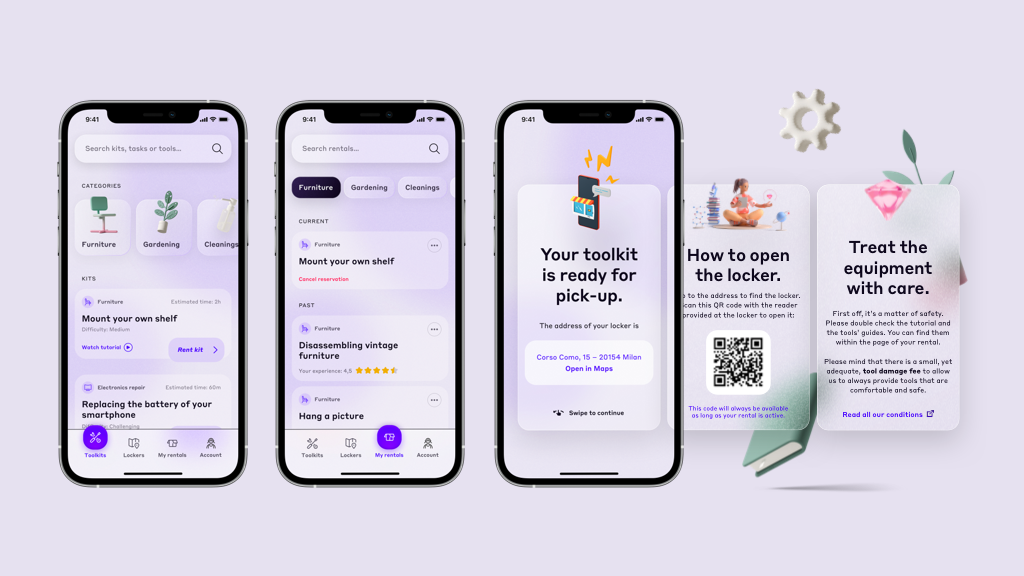
In 2021 I took part to Designflows, a mobile UI design contest organised by Bending Spoons and was selected as a finalist. I didn’t end up winning a top-3 prize, but being ranked in the top 40 among 2574 applicants made me proud nonetheless.
The concept
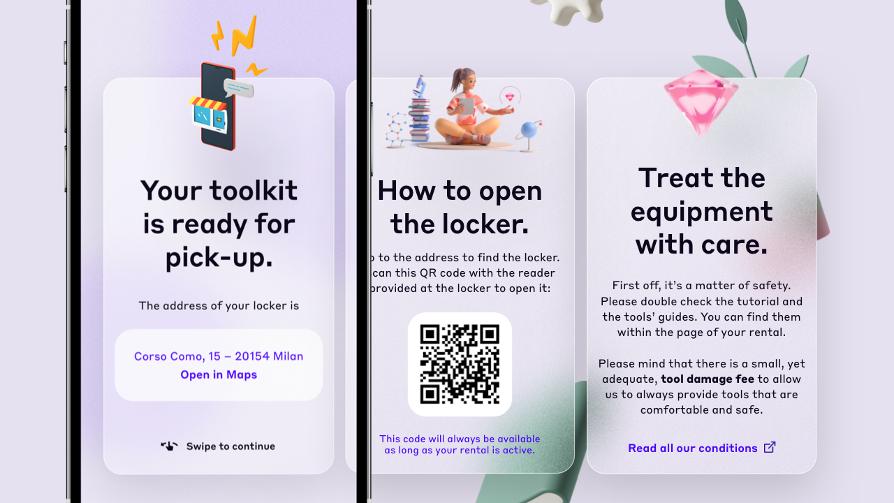
Participants were given a clear, quite specific brief: Homely is an imaginary app designed to let users rent DIY toolkits at physical lockers placed throughout the city. Each of us had to design three screens: the home page, where you browse the available kits; “My rentals”, where you see all the kits you have rent in the past; a screen to explain users how the service works.
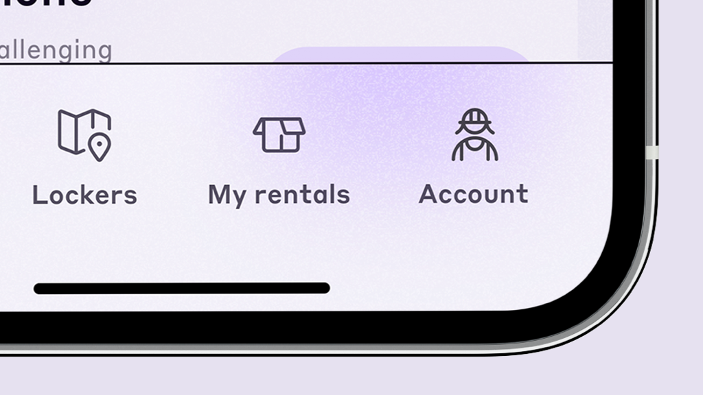
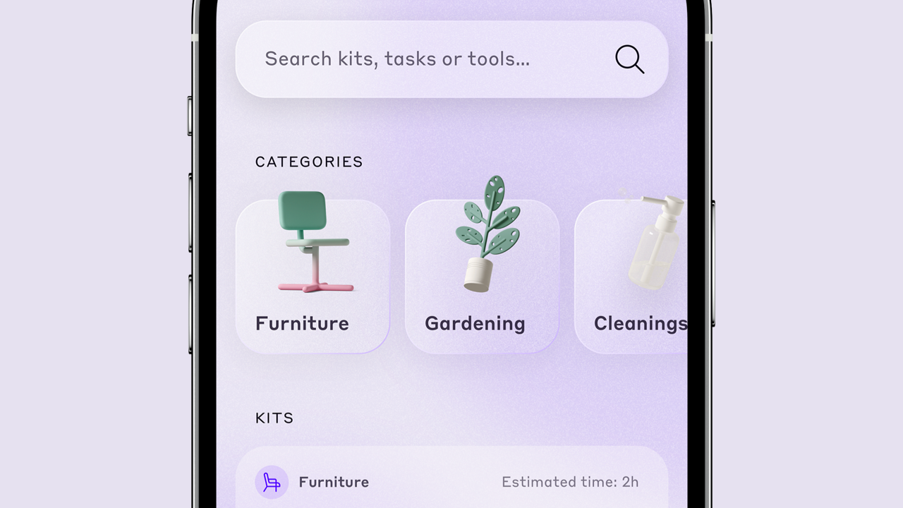
I wanted the whole app to look glassy and physical. The bottom bar may look white at first glance, but you can subtly see through it with a frosty, opaque effect. The categories’ tiles are domed and a stroke makes them come out of the screen, alongside the 3D illustrations – thank you Icons 8’s “Ouch!”. The selected page at the bottom looks pressed.
In the brief we were asked to design the app around the user story of Elena, a girl who needed to mount a new shelf. This is why the icon represents a female user.
The QR code brings you to a special area of the app.